UX Case Study
Case Study: Car Hire
The main objective with this case study was to create a better experience for the user in purchasing their desired product. This would involve having systems in place that would help users find items that suited their needs in the most optimal way. Before starting a design for a system like this, the first step would be to find the existing pain points users have with these sites.

Competitive Benchmarking

For this analysis, the companies evaluated were Europcar, Hertz, and Car Europe. They all share some similar characteristics on their platforms and with that they also share some common issues. As their repeating customers would already be accustomed with the structure of these websites, a radical change would be less beneficial than helpful, although some areas could use enhancement without detracting from the user's experience.
Each site contained a sizable search function where the user could enter the essential information, such as length and locations. As the user would move onto the search results, they do a poor job in narrowing down the results to what the user wants. Certain details, such as the overall fee or letting the user know that the vehicle they selected might not be the car they receive on the day, could be missed due to not being made clear enough.
Note Taking
Two different individuals were used to test the websites of competing companies in the same industry. The sites that the two testers tested were sixt.co.uk and greenmotion.co.uk. Both testers have had different experiences using sites like these. One would have used them as part of his job while the other would have used them more commonly for holidays and trips abroad.
For these tests they both were given the same objectives. Looking for a car with automatic transmission and having different pickup and drop off locations.


-
• Enters the website and the user’s eye is drawn to the search bar straight away.
• User is aware of the banner images but considers them to be ads hence is trying to ignore them
• Is more ‘task focused’ at this point
• Clicks on the location input field and types in London
• A suggestion drops down menu drops down
• User expected this to happen
• Clicks on London Gatwick that’s suggested
• User double checks that return location is the same as pick up location
• Finds the box is already ticked without any trouble
• Clicks onto pick-up-date and a calendar drops down
• User comfortably navigates through the calendar.
• Found the search function easy to use
• Wasn’t put off by the phase Show Offers for the CTA
• Has an understanding that its a marketing ploy to emphasize that they have offers
• Clicks onto CTA and brought to a page with the results meeting the information put in
• Understands that the cars are in order of price //
• User’s eye is drawn to the Automatic Transmission slider and clicks on it
• Page has its selection of cars change
• Clicks on the drop down menu for Driver Age
• What was selected already was correct for the user
• Now user looking at what the different menus have
• User wouldn’t normally look at the vehicle type since this wouldn’t be their main priority but for the basses of this test they click anyway //
• Does chose the sedan
• Would be a preference
• Clicks on the image of a Volkswagen Golf
• Banner drops down
• User considers the drop down banner to be an advert
• Looks at the top left corner and sees 9 of 41
• User considers this to mean that there 9 vehicles that match their search
• Unsure if they should scroll to the right or to scroll down
• User figures out quickly enough that they are to scroll down
• The user overall likes how the selection of cars are presented
• Isn’t sure if the images of the cars are doctored
• Checks different cars to see if the price advertised is correct
• Make sure that there’s no terms and conditions attached to them
• Clicking on the image of another car doesn’t respond
• This causes a slight bit of confusion but after another click the banner drops down
• User isn’t satisfied with what they see after clicking on the BMW and sees a Mercedes instead
• Does note that it does say ‘or similar’ but still not satisfactory to see a different car
• Even though he’s unsatisfied with this he would still continue
• He goes to compare another car, the Octavia
• Again the first click fails to register
• He would take note of the prices and would go ahead with one of the options
• Pay Online or Pay Later
• Knows the price can vary. This user’s preference would be to pay online
• Clicks select on the Octavia and is brought to the extras screen
• Likes the presentation of the icons
• Comfortable with the information on show
• Asked what Loss Damage Waiver is
• Doesn’t know exactly what it is but has an idea of what it could be
• Asked what Unlimited Miles is
• Knows what this is
• Task: Add a Friend
• Does this without much fuss
• Likes the Optional Features page
• Likes how it looks
• Double Checks that the tabs change colour after been selected
• Was sure that the did but wanted to confirm it
• Clicks on Show More Extras
• Clicks on and off the Receipt By Mail tab
• Happy to continue to the check out page
-
• Enters the website and finds it to be a bit busy
• Not interested in the whole right side since it looks like an ad (not interested in ads)
• Likes that the UK has a button of its own
• Clicks on UK and starts to type in the pickup and drop off locations
• Drop off suggests the 3 most popular locations in relation to pickup location
• Likes this feature
• Calendar has as issue in selecting return date
• The month won’t and the wrong year ends up being selected
• Could not continue due to booking time was to long
• Promo code feature does not interest him
• Clicks Search and is brought to the results page
• Likes this page
• Likes the columns separating each package
• The first car on show appears to be the promoted offer
• The Go Contactless doesn’t grab the user
• Has a good idea what this feature could be
• To filter results to show only automatics he clicks onto filter
• User wasn’t drawn to the icon since he had to look for it
• Once in the filter he found the option for automatic transmission easily enough
• Would expect to find the filter in the top right
• User would normally go for the premium package since they find it to be the best value
• Clicks on Book Premium
• Is unsure if it was the right thing to do
• On the Booking Summary page he knows he a click away from the payment page
• Confirms that the dates are correct
• Task: Ad an extra driver
• Not as smooth as previous site
• Had to scroll up and down to find where to do it
• After finding where to ad driver, its not clear what the price increase is
• Clicks Proceed and is brought to the Complete Booking page
-
• Enters the site and moves around the page looking at all the options
• Probably felt prompted to do so
• Is aware that the hamburger icon opens up the navigation
• Is the case for most websites
• Clicks on the location input field
• Types in London Gatwick in full
• Clicks on the airport to confirm selection in the suggestion drop down menu
• Picks dates using the drop down calendar
• Navigates through calendar with ease
• Picks times that will cover her for the full days
• Shows the user is familiar with the process
• Isn’t sure if the return location is the same as the pick up
• Clicks Show Offers //
• Likes to click through the filter options
• Clicks on the “Automatic Only” slider
• Clicks on the age drop down menu and “30+” is already selected
• Clicks on number of seats and slides it up to minimum 5 seats
• Priority is price and selects Lowest Prices First
• Scrolls down the page
• Would remove filters to see what would the lowest price be without them
• Not many filters so user is happy to continue
• Clicks on one of the cars
• Seems obvious enough where to click
• Car pops up on hover
• Information provided is a bit too simple
• Unsure what 21 years is
• Payment Summary is not clear
• Premium location fees is a bit ambiguous
• Not sure what that is
• Clicks select and is brought to the extras page
• Asked what Unlimited Miles is
• Knows what it means
• Asked what Lost Damage Wavier is
• Doesn’t know what that means
• Task: Add an additional driver
• Does this with ease
• Was surprised by the price jump
• Suggests that it should mention the total increase for the duration of booking rather than for the day
• Receipt By Mail has confusing language
• The use of the word Mail instead of Post suggests E-Mail
• Clicks on price details
• Sees the price in full for the additional driver [110.69]
• Clicks continue and is brought to the payment page
• Looks pretty standard/ expected
• Down the page the user clicks on the information ‘i’ icon to see where the airport is
• Could do with a map along with the address provided
-
• Enters website
• Eye is drawn to search section
• Looks at the ‘side bar’ and seems confused by contactless rental
• Asked what Contactless Rental is
• Does not know what it is
• Gives a guess of what it could be and isn’t far off
• To start searching for vehicles the user clicks on the button named United Kingdom
• Types in London Gatwick in full into the data input field
• Clicks into the drop off data input field
• Selects Heathrow from drop down suggestion menu
• Likes this ‘very clear’ feature
• Puts the dates in
• Navigates through the the Callander very well
• The month for the end date doesn’t show in calendar
• Clicks search
• A loading wheel shows
• Gives the user feedback that something is happening
• Has a look at the cars
• Clicks on the filter icon
• User isn’t showing the same confidence in finding or using the filter compared to previous site
• Admits the process wasn’t as fluid
• Comments someone older may have a problem in using it
• Users preference package would be the premium package
• Comparing the different packages was easy
• Too much information thrown at the user is a drawback
• Clicks Book Premium
• Enters Booking Summery page
• Get the impression the user isn’t entirely sure what to do straight away
• Task: Ad an additional driver
• Scrolls down page the page and finds where to ad the driver
• Did this easily enough
• Looks for the increase in price with the additional driver
• Scrolls up and down the page trying to find it
• Price is not clear
• Eventually finds the price
• Not clear what the cost of the additional driver is
• Assumes its the cost of its extras price
• Could say additional driver
• Clicks proceed
• User is brought to the Complete Booking page
• Not comfortable to go to payments page
• Goes back a page cause not entirely comfortable with package
• Clicks on Upgrade to Premium a few times
• Premium package was already selected. No need to upgrade to it
• Still a bit confused
Affinity Diagram

The information was acquired from taking notes during a few usability tests and benchmarking a number of industry rivals. The issues consumers kept encountering became fairly obvious. Several features, such as a filter, were anticipated but were absent. The required payment was not made clear enough. Also, there were advertisements and banners that served to annoy users rather than to aid them.
The first draft is shown in the images here. The diagram's final digital representation was produced with Miro and can be viewed by clicking the link below.


Customer Journey Map
The user is hiring a car for a reason. If they are planning on a short trip, they may have little luggage with them so a smaller car would meet their needs, but if it's a longer trip they may require something larger. Users' needs can differ from one another, therefore it would be helpful if they could narrow down their options to those that were more relevant to them.
Another issue for the user is knowing how much that is needed to be paid at checkout. It is not always clear to the user what is the required amount to reserve a car.

Flow Diagram
The user's objective in this case study is to rent a car. The user should be required to take as few steps as possible to achieve their goal. A flow diagram can be used to assess how many steps a user must perform.
I used previous usability tests as examples of how consumers might interact with a car-rental website. I discovered what could be a better route to the end goal after being even more more aware of where issues emerge. To get to the payments page using a more effective approach, the user would need to perform roughly seventeen actions or inputs.


Interaction Design
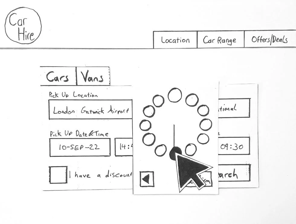
In using a Low Fidelity prototype, the proposed solution was tested to find any issues. Using a pen and paper a paper prototype was created. This showed on a basic level how a user could interact with the product.
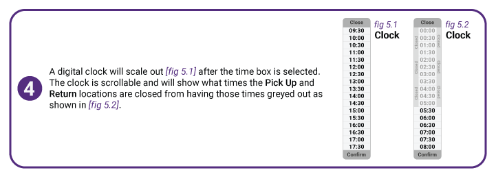
One of the problems that popped up was with the selecting the time. The design had to change since it wasn’t clear to the user how to use it. It was a common issue amongst the testers.
-
![Different Location]()
01
-
![Box Select]()
02
-
![Select Location]()
03
-
![Box Select]()
04
-
![Location Selection]()
05
-
![Date Select]()
06
-
![Calendar Open]()
07
-
![Next Month]()
08
-
![September]()
09
-
![The 10th]()
10
-
![18th Selected]()
11
-
![Confirm Dates]()
12
-
![Dates Done]()
13
-
![Clock Open]()
14
-
![14:00]()
15
-
![Clock Next]()
16
-
![Minutes]()
17
-
![14:45]()
18
-
![Confirm]()
19
-
![Drop Time]()
20
-
![9:00]()
21
-
![9:30]()
22
-
![Confirm]()
23
-
![Search]()
24
-
![Results]()
25
-
![Filter]()
26
-
![Options Selected]()
27
-
![Features]()
28
-
![Pay Online]()
29
-
![Extras]()
30
-
![More Info]()
31
-
![Added]()
32
-
![Continue]()
33
-
![Checkout]()
34




Prototype
Amendments were make to the design after some issues were put forward. One of the main issues was with the clock popping out for the user to select a time. A Medium Fidelity Prototype was created with a different solution to this problem was implemented.
The prototype was crated using Figma the Prototype can tested using the link below. This will give a good representation of how the website is to interact with.
UX Audit
For the developer to better understand how the site is meant to respond to the users action I used different labels to explain what is meant to happen. Here is an example how the annotations would be presented for each page.